Tuesday, February 25, 2014

Color Project

For the Past Week...

For the past week, we have been working on a thing we call a Color Project.  What we do is take a theme (Explore, Creature, and Disguise) and mix it with a medium (colored pencil, chalk, acrylic paint, etc.) of any colors and create something that was unique and colorful at the same time.  I chose to do some type of creature with colored pencils because I seem to have an easy time blending and mixing with them.  My immediate thought was, "Oh, duh, why not do a black stallion with the mane all colorful?" But then I realized how I didn't know how to draw a horse.  I tried and tried, but it wasn't working.  AT ALL.  I went and thought of something else.  I thought of maybe doing dolphin with a colorful sea or a hedgehog with colorful needle things as its....fur?  None of it was working!!  I probably sat for half an hour or so thinking.  Have you ever had an idea so exciting just come to you that you get all happy and do a little fist pump?  This is exactly what happened to me.  I got the jist that humans are creatures, too and I thought of doing a girl, with her eyes closed, with a whole lock of long colored/dyed hair.  I got the idea from looking through Kristina Webb's instagram page for her artwork.  Her drawing looked like this:
Sketch/Work-in-Progress
 
I took her idea and twisted it into a colorful girl with a slightly less impressive and flattened look. That is exactly what I had an issue with making her look like she's popping out of the paper.  She looks a little like Flat Stanley, but I guess that's OK.  I also had an issue with the "light" hitting her face.  I couldn't quite get the shading right on her, but I did my best and that's good enough.
Finished Product
The finished product, to me, looks pretty well done.  It took me about an hour and a half to make this and put my final touches on it.  I think the parts I did really well on was the sleeve and how it looks like its coming out the page and folding on her shoulder.  I also like the way I made the nose and eye.  Those are the parts on her that I am most proud of.  If I could change one thing on her, it would probably be the proportions.  Her head looks really big compared to her body and when I stare at my work for a long time, it bugs me.  This project, believe it or not, taught me how to make things pop out in your piece.  If you really like a certain part of your art and that's the part you want the people who see it to look at first then you should make that certain portion pop out of the page and grab the persons attention.  It's kind of like an intro paragraph in a English essay.  I also learned that if you don't know where to start with an art piece, you should definitely think it out.  I started with the hair and I figured out that I made the top of the hair/head a little too big for her body so I just had to go with it! Anyway, colors in art is an awesome way to show how you feel about something.  For instance, red could be love or anger and blue could be calm, cool and collected.  It doesn't even have to show something!  You could just make a colorful piece to make a colorful piece! IT DOES NOT MATTER! It's art.  You can do whatever you want with it.

Friday, February 7, 2014

2-in-1 Project

A Swan and a Goose Feb. 4, 2014

What is a 2-in-1?

       A 2-in-1 is a piece of art that incorporates two objects, animals or whatever you would like into one thing.  Now, it doesn't have to be two things that are related in any way, but it definitely could be.  It could possibly be a donkey and a horse that share similarities or an ostrich and a fish who share nothing at all.  The two objects that I chose are two types of birds that are pretty similar.  I chose a swan and a goose because they are pretty alike.  They have the same body shape, they eat the same food and pretty much have the same habitat. At first, I spent half an hour trying to figure out how to put the two together and I couldn't really find any way to do it without it looking like a swan with a grey body until I took a walk a couple days ago.  I was walking and I overheard a couple kids talking about how to morph different animals and their names (which is really ironic) and they told each other that a trout and a goldfish doesn't need a body to swim, they can just use their heads.  It's a pretty weird way to get my idea, but I least I got it!  I thought, "Why not put the two heads together and great an animal that looks nothing like an animal.  This is my sketch:
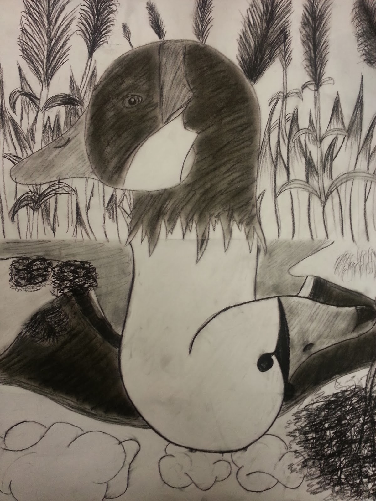
Now, this is just my sketch.  The real project is a 24x18 sheet of paper and I used charcoal because I thought it was the easiest way to express the different between the two birds.  A swan and a goose don't have many colors in them besides grey, black and white and I thought it would probably be easier to show the different shades in them by shading the charcoal and testing it out.  I could choose how dark I wanted the pencil to be and I could use the charcoal stick to fill in large areas of the birds like the majority of the gooses head.  I kind of had some trouble trying to make the thickets of grass look realistic, but I did the best I could and I honestly think it looks pretty good.  When I started the bridge for the swan's half of the paper, I choose the Gapstow bridge in Central Park of New York City.  I was born in New York so, I really thought I should draw one of the 36 bridges in the city. Other than those two issues, I had a really fun time drawing this out and spending time trying to make it perfect.

The Finished Product

By the time I was finished, I was pretty proud.  The shape of the goose and swan's head was in perfect shape and the background was pretty good.  I think the best part about my project is the birds itself.  I really like how the shape of it just kind of went exactly how I wanted it to be and how the beaks differ from the goose and the swan.  I'm not completely proud of the way the background of the birds were drawn, but I did my best and it's good enough for me.  Plus, my art teacher loved the way it turned out so, that's pretty amazing too! Anyway, I would probably change the way I drew the bridge behind the swan because I didn't really put that much detail into it and I really wish I had.  The final outcome:
Yet again, the swan's neck was merged with the goose's neck to create an abnormal look, but that's what my favorite part is.  I just like the way I drew the fur going into each other.  I put the grey goose fur on top because they are what you're prone to see when you go to a lake or pond.  I drew in a bridge and a tree (a New York look) because when you think of a swan, you think pretty, romantic things.  The first thing I thought of was Central Park of New York.  I put in a thicket of grass behind the goose because that's what they eat and that's where you're most likely going to be seeing him.  That's basically how my piece of art came to be!